Search Results
Package Design
Graphic Design
Bronze Winner
Entrant:
ADESTY Inc.,
Osaka
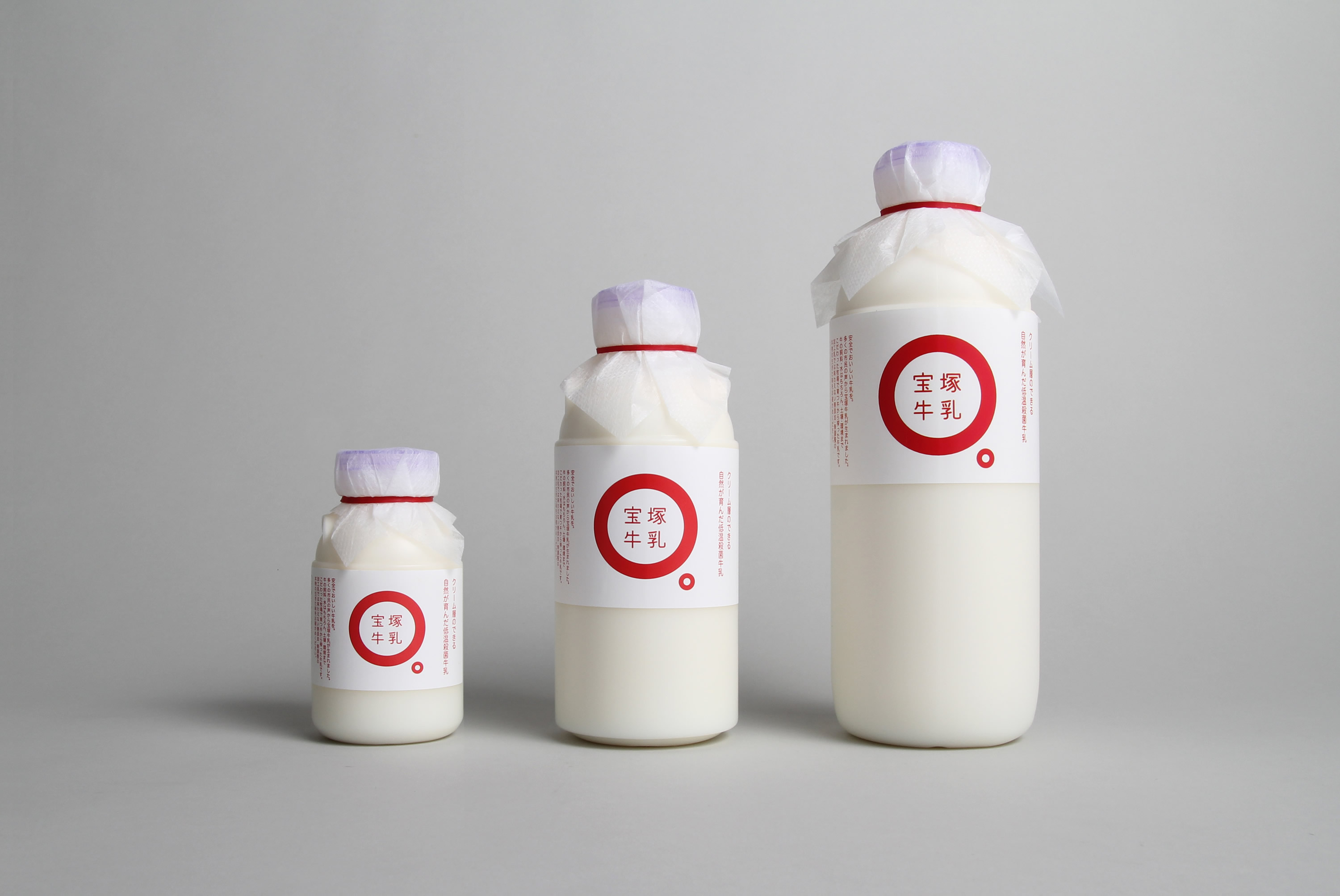
Takarazuka Milk
Takarazuka Milk
-
Corporate Name of Client:Takarazuka Milk Inc.
-
Art Director:Tatsuma Uematsu
-
Graphic Designer:Tatsuma Uematsu
-
Description of the Project:
-
Everything about Takarazuka milk is so good! This milk was produced upon the request from many residents of Takarazuka who would like to drink ‘safe and tasty milk’.
All processes from cow-breeding to milk production take place in Takarazuka. Traditional manual production techniques are employed and only non-homogenized milk is produced.
This milk is so good in terms of everything including taste, quality, and staff.
The package is in Japanese language only. The logo mark combines a large circle and a small circle which is the end punctuation mark of Japanese language. It represents straightforwardly that ‘Takarazuka milk is genuine milk’.
-